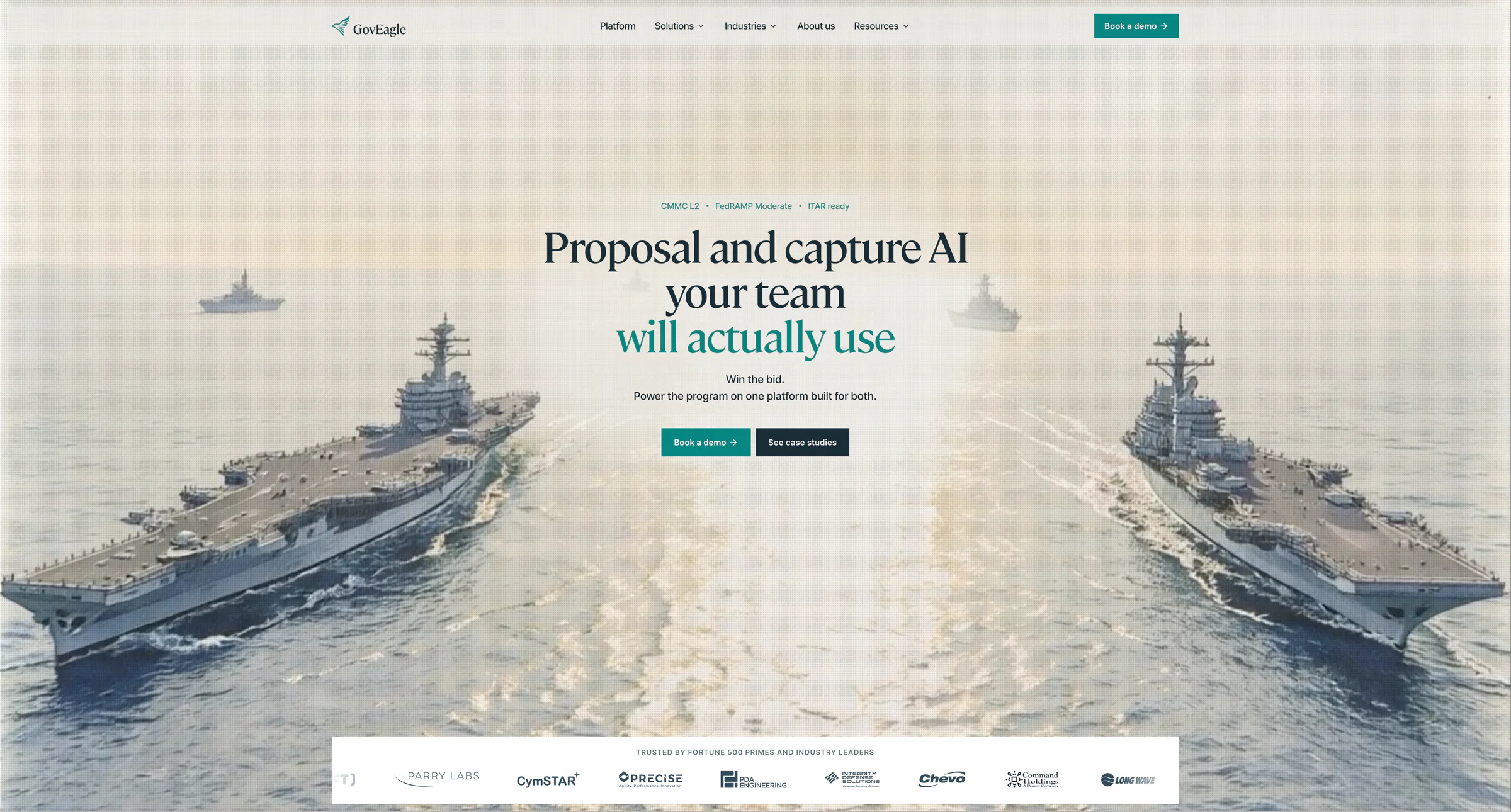
GovEagle is a purpose-built AI workspace for government contractors. It connects business development, capture, proposal, and delivery context so knowledge can move with each pursuit instead of being rebuilt at every handoff.
On its current website, GovEagle reports 100+ GovCon customers, $1B+ in awards won by customers, and a 50%+ reduction in proposal time. These figures are company and customer context - they are not outcomes attributed to heartbeat's design work.
Most AI-native products reach technical maturity before they reach narrative maturity. The product works. The team understands it deeply. But the website still reads like a list of features with a vague headline about AI, and buyers - who have maybe 30 seconds of attention - leave without understanding what they just looked at.
That gap is not a design problem. It is a communication problem. And it shows up most visibly on the website.
This piece is a practical guide for founders and product teams working through that problem. We use GovEagle as the central example because it is a real case of translating a complex AI-native product into something people can understand, evaluate, and trust quickly. On this project, our role was to connect brand strategy, messaging, UX, website design, and coded development into one clearer product story.
Three things this article covers:
Why complex AI products are hard to communicate clearly on a website
What changes when you design for clarity and trust, not just aesthetics
What founders can take from the GovEagle example and apply to their own product
What makes AI product websites hard to get right
The default failure mode is saying "AI-powered" and stopping there. That phrase communicates nothing about what the product helps users do, who it is for, or why it is credible. It just signals that the team is aware AI exists.
The deeper problem is structural. Complex products have a lot to explain, and most websites try to explain everything at once. The result is a page that technically covers the product but leaves buyers more confused than when they arrived.
A website for a complex AI product needs to do three things fast: prove the capability is real, make the workflow legible, and give a skeptical buyer a reason to keep reading. That is a demanding standard, and it requires a specific hierarchy of information.
The hierarchy that works for complex AI products:
Category - What kind of product is this? What space does it compete in?
Workflow - What does the user actually do with it? What process does it fit into?
User - Who specifically is this for? The more precise, the better.
Outcome - What changes for the user after using it?
Proof - Why should the buyer believe any of the above?
Most AI product websites jump straight to features or outcomes and skip category and workflow entirely. That forces the buyer to do interpretive work the website should be doing for them.
The first screen is not a branding exercise. It is a clarity test.
Why GovCon raises the bar for clarity and trust
Government contracting is not a market where vague innovation language lands well. GovCon buyers - BD directors, capture managers, proposal teams - are operating across fragmented, high-stakes stages: business development, capture, proposals, and delivery. They are not looking for a tool that sounds impressive. They are looking for something that fits their actual workflow and reduces risk.
That makes generic SaaS messaging especially ineffective here. Clarity beats complexity in GovCon positioning. The strongest positioning starts with the contractor's workflow and operational reality, not with abstract claims about the company.
The table below shows the difference in practice:
Generic SaaS messaging
GovCon-ready messaging
"AI-powered proposal automation"
"AI workspace for BD, capture, and proposal teams"
"Streamline your document workflow"
"Connect pursuit knowledge across the full capture lifecycle"
"Trusted by teams everywhere"
"YC-backed, serving 100+ GovCon customers"
"Fast, smart, scalable"
"Built for government contractors, not adapted from generic SaaS workflows"
"See how it works"
"Purpose-built for the capture-to-delivery lifecycle"
The left column is not wrong, exactly. It is just doing nothing for a GovCon buyer who needs to immediately see that this product understands their world.
Specificity is the trust mechanism. The more precisely a product describes the user's reality, the more credible it becomes.
Turning product complexity into a clearer website narrative
GovEagle came to heartbeat in early 2026 to rework the website around the product the company had become. The engagement connected brand strategy, messaging, UX, website design, coded development, the visual system, collateral, and ongoing support.
That product maturity was the starting point for the project. The website needed to communicate the company GovEagle had become.
That is a compelling product. But a compelling product still needs a compelling website to communicate what it does.
The product story needed to reflect how GovEagle had expanded beyond proposal acceleration. The clearer framing presents it as an AI-native workspace for government contractors, with continuity across business development, capture, proposals, and delivery.
How the emphasis changed:
Earlier emphasis: Proposal speed and document generation
Updated emphasis: A connected workspace for pursuit knowledge across BD, capture, proposals, and delivery
Earlier emphasis: Individual product features
Updated emphasis: The way GovCon teams move through the work
Earlier emphasis: Product capability shown in isolation
Updated emphasis: Product, workflow, security, and customer evidence working as one story
The website had to make all of that legible in seconds. Not by explaining more, but by structuring the story so buyers could follow it without effort.
What we worked on
The work connected strategy and execution because the product story had to hold across every layer. Brand, messaging, UX, visual design, and development needed to reinforce the same idea.
Category definition
Together, we clarified the category around what GovEagle had become: an AI-native workspace for government contractors, with continuity across the full contracting lifecycle. That framing became the anchor for every subsequent decision.
Workflow-led messaging
Technical depth is an asset, but only if it is translated into language buyers recognize as relevant to their work. The messaging was organized around the contractor's workflow - BD, capture, proposals, and delivery - while the AI remained the engine underneath it.
Website structure as proof path
Buyers move from headline to proof in a predictable sequence. The site architecture supports that movement without asking buyers to work for it. Each section earns the next: category, workflow, user, outcome, and proof. For GovEagle, that proof comes from product fit, Microsoft and SharePoint integration, security, customer stories, and reported customer outcomes.
Visual system built for a serious GovCon buyer
The visual language needed to signal maturity and sector fit. Not generic SaaS aesthetics - something that reads as stable and credible to a government contractor evaluating a new vendor. The site was built as a custom experience, which gave us the control to hold that consistently across every screen.
Brand, messaging, UX, and website were treated as one system. That is the only way the clarity holds.
What makes GovEagle credible to GovCon teams
Most B2B buyers are skeptical by the time they reach a website. They are looking for reasons to disqualify, not reasons to believe. The website is where that skepticism either gets resolved or hardens into a closed tab.
For GovCon buyers specifically, credibility comes from operational fit as much as company scale. Buyers need to see that a platform understands their workflow, works with their existing tools, protects sensitive data, and has evidence from teams doing similar work.
The current GovEagle story makes four forms of proof easy to understand:
Purpose-built workflow - continuity across business development, capture, proposals, and delivery
Native workflow fit - SharePoint, Word, Excel, and PowerPoint remain part of how teams work
Enterprise security - GovEagle describes the platform as FedRAMP Moderate Equivalent and ITAR ready, with no customer data used to train AI models
Customer evidence - 100+ GovCon customers, customer stories, and $1B+ in awards won by customers, as reported by GovEagle
The placement rule: proof should explain why the product fits the buyer's world, not simply decorate the page with logos or funding figures. Product details, security, integrations, and customer evidence are strongest when they appear inside the product story.
What this means for AI-native startups
The GovEagle work is a specific case, but the pattern applies to any complex AI product trying to communicate clearly to a skeptical buyer.
Four steps worth taking before touching visual design:
Write the one-sentence product definition. Not a tagline. A plain-language statement of what the product is, who it serves, and what it helps them do. If that sentence is unclear, the website will be unclear.
Map the product story to the user workflow. Buyers do not think in features. They think in stages of their own work. Show where the product fits into that sequence.
Make proof visible early. Funding, customers, outcomes, security signals, or adoption proof - whatever is true and verifiable. Put it where buyers will see it before they decide whether to keep reading.
Treat brand, UX, and website as one system. A sharp visual identity with weak messaging, or strong messaging with a confusing site structure, does not resolve the clarity problem. All three have to reinforce the same idea.
The website is not the last step in a product launch. It is the first thing most buyers see. It should do the work of making a complex product feel legible, credible, and worth evaluating further.
Final takeaway
For heartbeat, this is the kind of work that matters most: turning a strong but complex product into a brand and website that buyers can understand quickly.
The work on GovEagle was broader than a visual refresh. It made a technically strong, genuinely useful product easier to understand, trust, and evaluate for buyers with limited time and high stakes.
That is the standard worth applying to any AI-native product website. Not "does it look good?" but "can a skeptical buyer understand what this is, who it is for, and why it is credible in under 30 seconds?"
If the answer is no, the design problem is actually a communication problem. And it needs to be solved at the level of brand strategy and messaging before anything else.
We are a seven-person senior design studio helping AI-native and technical product companies clarify their brand, product story, and website. Our work spans brand, product, and website design. If you are comparing design partners, our client feedback is also available on heartbeat on Clutch.
FAQ
What is an AI product website design strategy?
It starts with clarity. An effective AI product website explains what the product does, who it is for, and why it is credible before it gets into features. The best sites make the workflow legible fast, then use proof to reduce doubt.
Why is GovCon UX design different from standard SaaS design?
GovCon buyers are risk-sensitive and work across fragmented stages like BD, capture, proposals, and delivery. That means the site has to do more than look polished. It needs to show operational fit, trust, and relevance to the buyer’s actual workflow.
How do you make a complex product feel easier to trust?
You connect brand, messaging, UX, and proof into one story. Instead of saying ‘AI-powered’ and leaving it there, you show what the AI helps users do, who benefits, and what makes the product a safe choice to evaluate.
What did heartbeat do for GovEagle?
heartbeat connected brand strategy, messaging, UX, website design, coded development, and the visual system. Together with GovEagle, the team clarified how the product carries knowledge across business development, capture, proposals, and delivery, then translated that story into the website.
What should founders take from the GovEagle project?
The main lesson is that a strong product still needs a clear story. If buyers cannot understand what the product is, who it is for, and why it matters quickly, the website is creating friction instead of removing it.
When the product is strong, but the brand story has fallen behind
At heartbeat, we help AI-native and high-growth teams turn complex products into sharper brands, clearer websites, and product experiences people understand.
GovEagle
AI-native GovCon workspace
GovEagle helps government contractors connect pursuit knowledge across BD, capture, proposals, and delivery.
We refreshed the identity, designed and built the website, and created marketing materials and tools their team could keep using.
YC W23
$2.5M raised
100+ GovCon customers
$1B+ awards won by customers
Hyros
AI-powered ad tracking and attribution
Hyros helps performance teams track revenue across paid channels and feed cleaner data into AI-driven marketing decisions.
We refreshed the brand, improved core UI surfaces, redesigned the website, and supported the product with senior execution.
3,000+ global businesses
$3.5B tracked ad spend
Founded by Alex Becker
AI ad attribution
Emhance
AI-powered playtesting for mobile games
Emhance helps game teams understand player emotion through eye-tracking, facial coding, and AI-powered creative analysis.
We created the identity, brand guidelines, launch video direction, and website experience for a sharper market launch.